Redesigning BullionByPost from the Ground Up
Project Summary
Role:
Lead UI/UX Designer & Front-end Developer
Industry:
E-commerce / Fintech
Responsibilities:
UX, UI Design, Front-end Architecture, Front-end Development, Research, Stakeholder Collaboration
Technology:
Django, Bootstrap 4.6, Sass, JavaScript, Gulp
Focus:
Responsive Design, Customer Journey, Conversion, Performance, Accessibility
Key Results
~19%
Estimated increase in registration rate in the first 90 days
~4.2%
Estimated increase in purchase rate in the first 90 days
70s → 90s
Page Speed performance and accessibility scores
10 websites
UK redesign followed by rollout across nine international sites
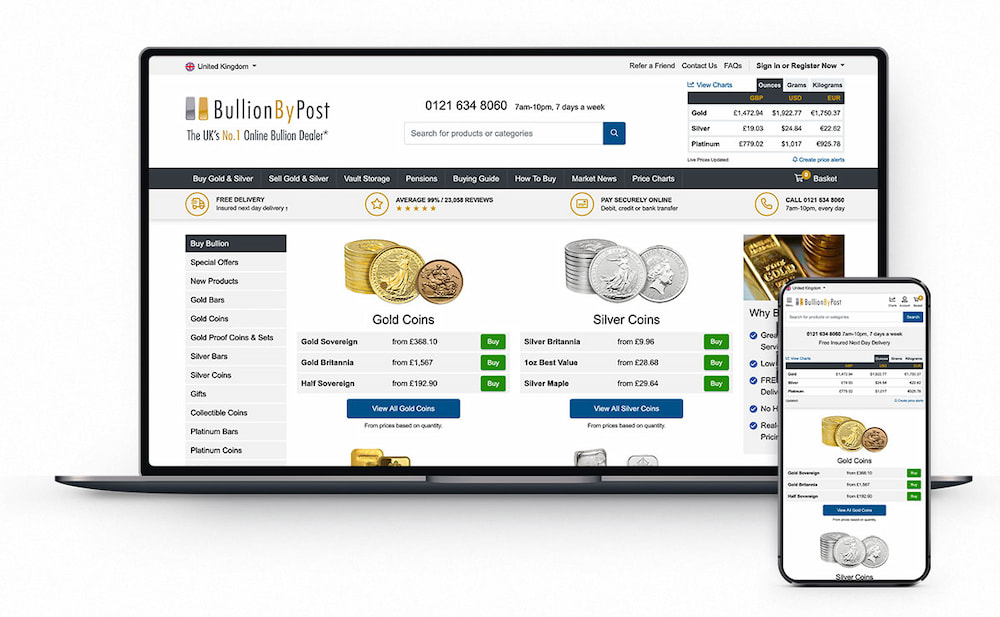
BullionByPost is one of the UK’s largest online precious metal retailers. In 2021, I led a complete redesign and front-end rebuild of the website, modernising everything from the underlying front-end architecture through to navigation, product discovery, registration and checkout.
The project launched on BullionByPost UK in July 2021 before the new design system and front-end foundation were rolled out across nine international websites in March 2022.
Overview
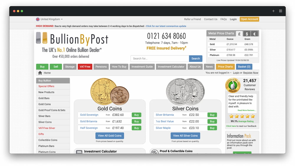
The existing BullionByPost website had originally been built several years earlier and hadn’t evolved much since.
By 2021, the front end was showing its age. Some layouts still relied on tables, images were being used where modern CSS could do the job, the site was running on an older version of Bootstrap and years of additions had created an increasingly difficult codebase to maintain.
Mobile usage was also growing quickly, but the experience hadn’t been designed around the way customers were now using the site.
Rather than continuing to patch individual areas, we made the decision to redesign and rebuild the front end from the ground up.
The Challenge
BullionByPost wasn’t a new product where we could start with a blank canvas.
It was an established e-commerce business handling high-value transactions every day, with existing customers, search rankings, back-end systems and business processes that couldn’t simply be replaced.
The challenge was therefore much bigger than making the website look more modern.
We needed to improve the customer journey, simplify key conversion points and create a much stronger technical foundation, while preserving the Django back-end and existing functionality the business relied on.
Browser support added another challenge. A meaningful number of customers were still using Internet Explorer 9, 10 and 11, so I had to modernise the experience while remaining conscious of older technology.
Key Challenges
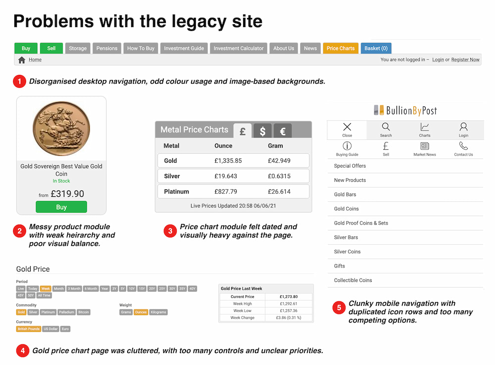
- A poor mobile experience
Navigation and key customer journeys weren’t designed around the growing number of customers using mobile devices - Friction in key conversion journeys
Registration and checkout had become unnecessarily complicated, creating barriers at some of the most commercially important points on the site. - Legacy front-end architecture
Years of incremental changes had resulted in inconsistent layouts and code that was increasingly difficult to extend without introducing more workarounds. - Modernising without breaking the business
The new front end still needed to work with existing Django templates, back-end logic and older browser requirements.
Understanding the Problems
Because the redesign touched every part of the website, I wanted to understand where improvements would have the biggest impact before starting on the visual design.
I used Google Analytics to identify our highest traffic pages, important customer journeys and the areas most closely connected with conversion.
I also met with teams across the business, particularly Customer Services and Marketing. Customer Services gave me a valuable view of the problems customers were actually experiencing, including common questions, areas of confusion and parts of the journey that regularly generated support requests.
Alongside this, I carried out extensive competitor research to understand how other precious metal retailers and e-commerce businesses approached navigation, product information, registration and checkout.
Bringing those different sources together helped us prioritise the areas that needed the most attention.
My Approach
As the only dedicated front-end designer and developer on the team, I had ownership of the project from the early design stages through to implementation.
I worked directly with key stakeholders to understand business requirements, map out customer journeys and create wireframes before moving into detailed UI designs in Sketch.
Because I was also responsible for building the front end, I could think about design and implementation together rather than treating development as a separate handover.
That became particularly important when working with the existing Django platform. Some back-end logic was closely tied to old Bootstrap classes and markup, so modernising the front end often meant diving into the back-end code to carefully update existing functionality at the same time.
Building a Better Foundation
One of the most important parts of the project wasn’t something customers would ever see directly.
The existing front-end code had become difficult to maintain. New features were often added as isolated fixes rather than being built on a consistent system.
I upgraded the platform to Bootstrap 4.6 and introduced Sass and Gulp, creating a much clearer front-end architecture.
Reusable components, consistent layouts and shared patterns replaced many of the one-off solutions that had built up over the years.
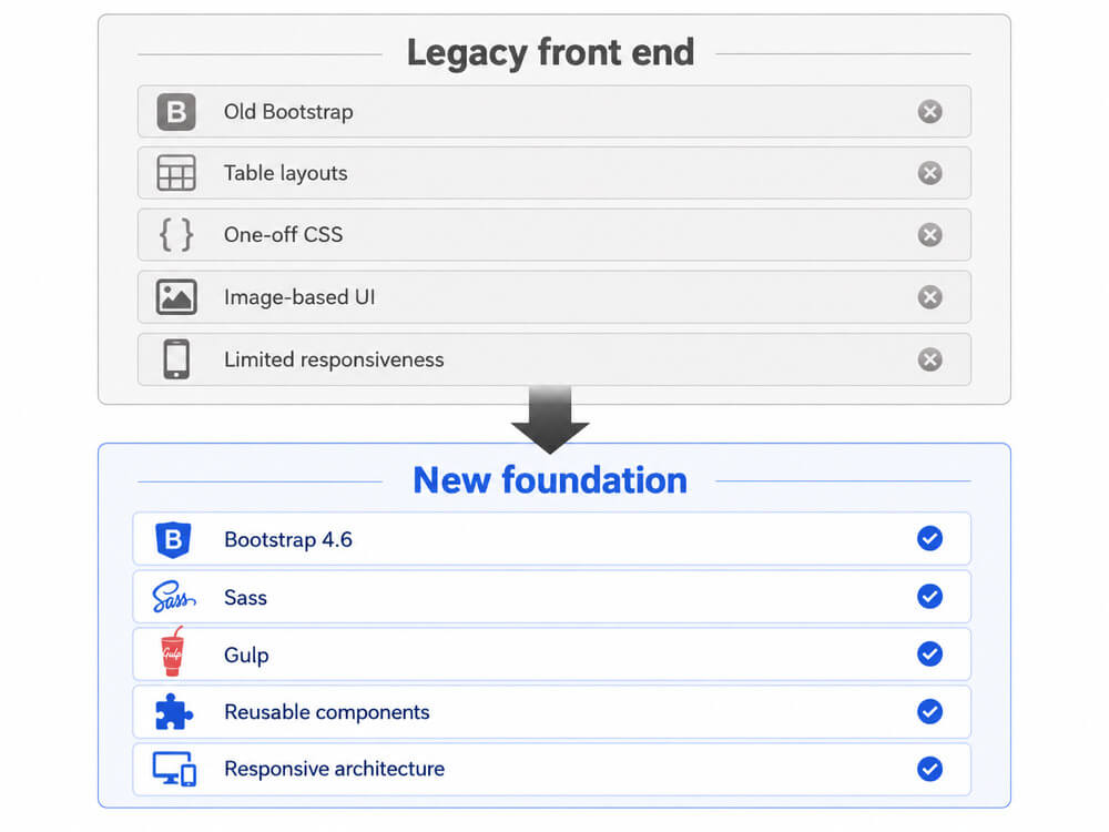
This meant the redesign wasn’t just improving the website we had at the time. It was more performant with little dependence on images and a smaller CSS stylesheet footprint. It created a foundation that could be extended and improved for years afterwards.
Improving the Customer Journey
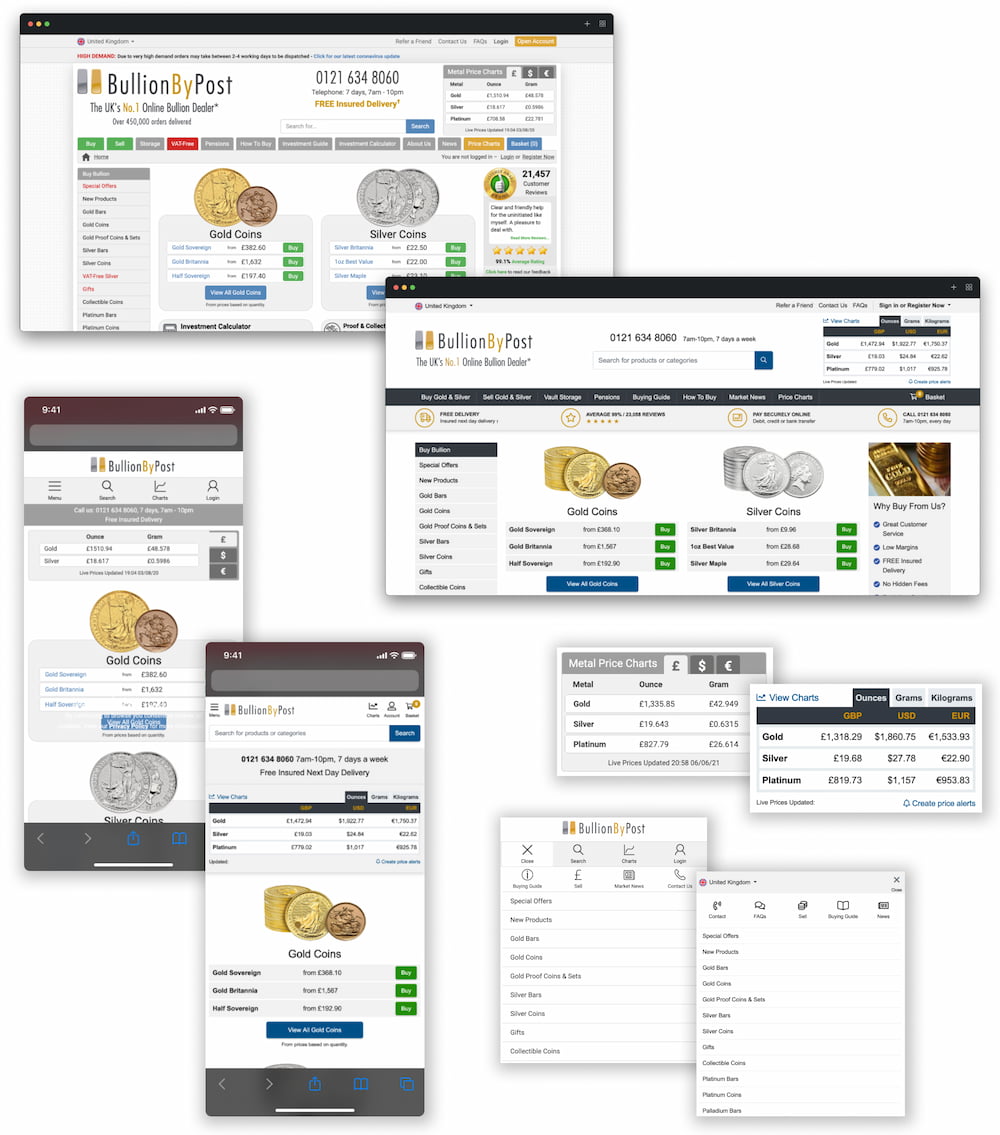
A responsive experience built around modern browsing
Mobile was becoming an increasingly important part of the BullionByPost audience, but the previous experience hadn’t been designed with mobile customers in mind.
I redesigned the site responsively from the ground up and with a mobile first approach, simplifying layouts, improving navigation and making key actions easier to complete across different screen sizes.
Rather than treating mobile as a smaller version of the desktop website, I looked at how content and actions should be prioritised for customers using smaller screens.
Simplifying registration
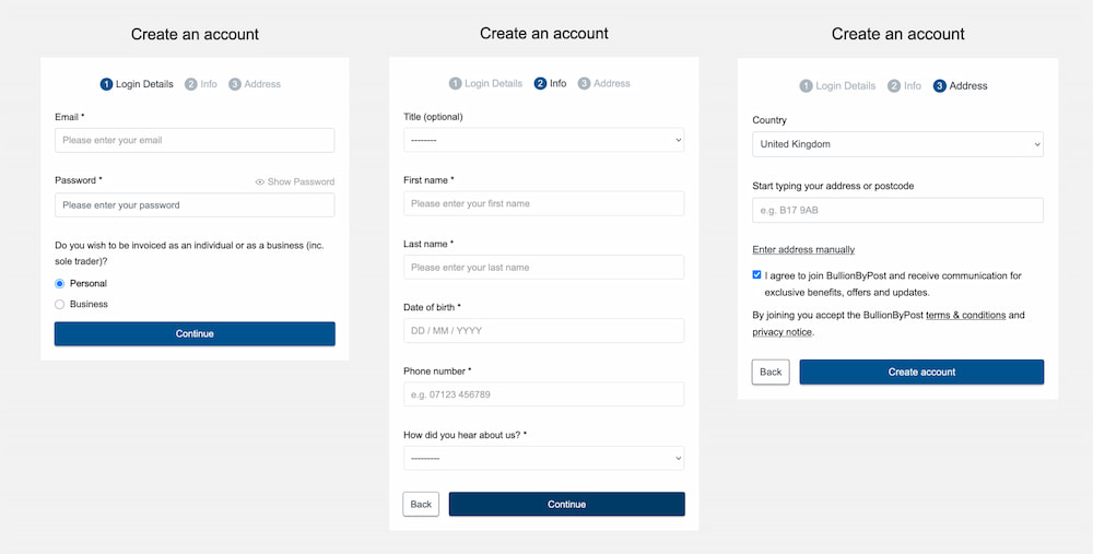
Registration was one of the key areas where we identified unnecessary friction.
I simplified the journey and made the process clearer, reducing the amount of effort required for customers to create an account and continue with their purchase.
In the first 90 days following launch, we estimate the registration rate increased by approximately 19%.
Making checkout easier
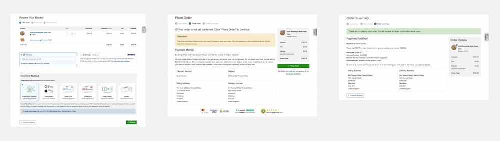
For an ecommerce business, even small amounts of friction during checkout can have a significant commercial impact.
The redesigned checkout focused on clearer information, simpler layouts and making it easier for customers to understand where they were in the process and what they needed to do next.
Our historical analytics indicate an estimated 4.2% improvement in purchase rate during the first 90 days following the redesign.
Clearer product pages
Precious metal products can involve a lot of information, including live pricing, premiums, specifications, stock and delivery information.
The new product pages improved the hierarchy of that information, making it easier for customers to understand the product, price and purchase options without removing the detail experienced investors expected.
Performance & Accessibility
Performance and accessibility were also major areas of improvement.
The previous site carried years of legacy front-end code and assets, which affected both page performance and accessibility.
As part of the rebuild, I reduced unnecessary markup, replaced outdated techniques, improved responsive behaviour and introduced a cleaner component structure.
PageSpeed Insights performance and accessibility scores improved from around the mid 70s to the mid 90s on key pages.
The technical improvements also supported SEO, with a number of important pages improving their search rankings within the months following launch.
Rolling the Redesign Out Internationally
BullionByPost UK launched with the new design in July 2021.
The architecture had deliberately been created with reuse in mind, so the work could become the foundation for the wider group of international websites rather than remaining a one-off UK redesign.
In March 2022, the new front end was rolled out across nine additional international websites.
This introduced a much more consistent experience across the group and meant future improvements could be built on the same shared foundation rather than maintaining completely separate front ends.
The Outcome
The redesign delivered improvements on both sides of the product.
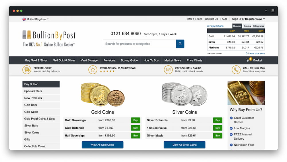
For customers, the website became easier to navigate, more responsive, faster and simpler to use across key journeys such as registration and checkout.
For the business, the new architecture provided a much stronger foundation for future development, reduced the need for one-off front-end fixes and made it easier to introduce new functionality across multiple websites.
We also saw measurable improvements following launch, including increases in registrations and purchases, stronger Page Speed and accessibility scores, improved organic search performance and fewer customer support issues relating to areas of the website that had previously caused confusion.
Most importantly, the redesign wasn’t the end of the work. It gave us a platform we could continue to improve.
Continuous Improvement
Since the original redesign, I’ve continued to work on BullionByPost through ongoing UX improvements, experimentation and new product features.
Rather than treating the 2021 launch as a finished product, we’ve continued to use analytics, A/B testing, customer feedback and business requirements to identify opportunities to improve the experience.
This has included redesigning areas such as navigation, price charts and landing pages, improving accessibility and performance, and continually refining key customer journeys.
Some of these have become substantial projects in their own right and form part of my wider work on the platform.
What I’m Most Proud Of
What I’m most proud of is the scale and ownership of the project.
I was able to take the redesign from early research and stakeholder conversations through wireframes, UI design, front-end architecture and implementation, before seeing it deployed across multiple international websites.
It wasn’t simply a visual redesign. We improved the customer experience, delivered measurable commercial results and rebuilt the technical foundation the website continues to evolve from today.
Working across design, development and the wider business also reinforced something that has become a big part of how I approach product design: the best solutions come from understanding the whole problem, not just the interface.