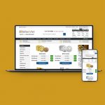
Gold.co.uk – Creating a Modern, Trustworthy E-commerce Experience
Project Summary
Role:
Lead UI/UX Designer & Front-end Developer
Industry:
E-commerce / Fintech
Responsibilities:
UX, UI Design, Front-end Architecture, Front-end Development, Research, Stakeholder Collaboration
Technology:
Django, Bootstrap 5, Sass, JavaScript, Gulp
Focus:
Responsive Design, Customer Journey, Conversion, Performance, Accessibility
Gold.co.uk is one of the UK’s leading precious metals retailers, selling gold, silver and other bullion products to private investors.
The existing website had become dated both visually and technically. Built on Bootstrap 3 with table-based layouts, image sprites and years of legacy frontend code, it no longer reflected the credibility of the business behind it.
I was asked to completely redesign the website, with almost complete creative freedom over its visual direction.
As the sole designer and frontend developer within the business, I took the project from initial concepts and prototyping through to frontend architecture, implementation, testing and launch.
The challenge – Building trust from the first interaction
Buying precious metals is very different from a typical ecommerce purchase. Customers can spend thousands of pounds in a single transaction, often with a company they may not have dealt with before.
The existing Gold.co.uk website looked old and lacked the visual polish expected from a business handling high-value transactions.
The redesign therefore wasn’t just about modernising the interface. The website needed to establish credibility from the moment a customer arrived.
At the same time, Gold.co.uk operates in the same market as BullionByPost and serves a broadly similar audience. Although both websites shared much of the same underlying technology, I wanted Gold.co.uk to have its own visual identity rather than feel like the same website under a different brand.
My aim was to create an experience that felt: Modern. Trustworthy. Clean. Comfortable. Distinct.
Defining a new visual direction
Apart from the existing Gold.co.uk logo, there were no established brand guidelines to work from.
This gave me the opportunity to define the visual direction of the website from the ground up, including typography, spacing, colour, components, iconography, illustrations and overall page structure.
Rather than simply making the old interface look newer, I focused on creating a calmer and more considered experience.
Clear typography, increased whitespace and a stronger visual hierarchy helped make complex product and investment information easier to understand, while consistent interface patterns helped reinforce credibility across the site.
From concepts to prototype
I designed the new experience in Sketch before creating an interactive prototype in InVision.
This allowed the visual direction and key customer journeys to be presented to the Marketing Director before development began.
The prototype went through several rounds of stakeholder feedback and iteration, but the overall concept remained largely intact through to the final build.
Once the design was signed off, I moved directly from designer to developer and began rebuilding the frontend.
Rethinking the product experience – Making complex products easier to buy
The product pages were one of the areas where I had the greatest opportunity to rethink the existing experience.
Bullion products can contain a large amount of information, including live pricing, quantity discounts, specifications, tax information, delivery options, storage, price alerts and customer reviews.
The previous pages made this information difficult to navigate.
I redesigned the product experience around a much clearer hierarchy, bringing the product, price and primary purchasing options together while making secondary information easier to explore.
The result was a cleaner and more focused buying experience that was considerably different from both the old Gold.co.uk website and many competing precious metals websites at the time.
The outcome
The redesigned Gold.co.uk launched on 16 November 2023, replacing a dated legacy interface with a modern ecommerce experience and a much stronger visual identity.
Registration performance improved across every measured post-launch period.
+19.52% Registration rate after 90 days
+26.63% Registration rate after 180 days
+39.17% Registration rate after 365 days
Purchase behaviour took longer to stabilise following launch. The purchase rate initially fell during the 90 and 180-day comparison periods before recovering over the longer term.
After 365 days, purchase rate had increased from 0.41% to 0.52%, based on the underlying analytics data.
More than a visual redesign
Gold.co.uk gave me the opportunity to take ownership of almost every aspect of a major ecommerce redesign.
I defined the visual direction, designed and prototyped the customer experience, created the design system, rebuilt the frontend architecture and implemented the final website.
The project transformed an ageing website into a modern platform with its own distinct identity, while working within the limitations of an established ecommerce backend.
It also became a proving ground for ideas that were later adopted across other websites within the business, extending the impact of the project beyond Gold.co.uk itself.